Web Design
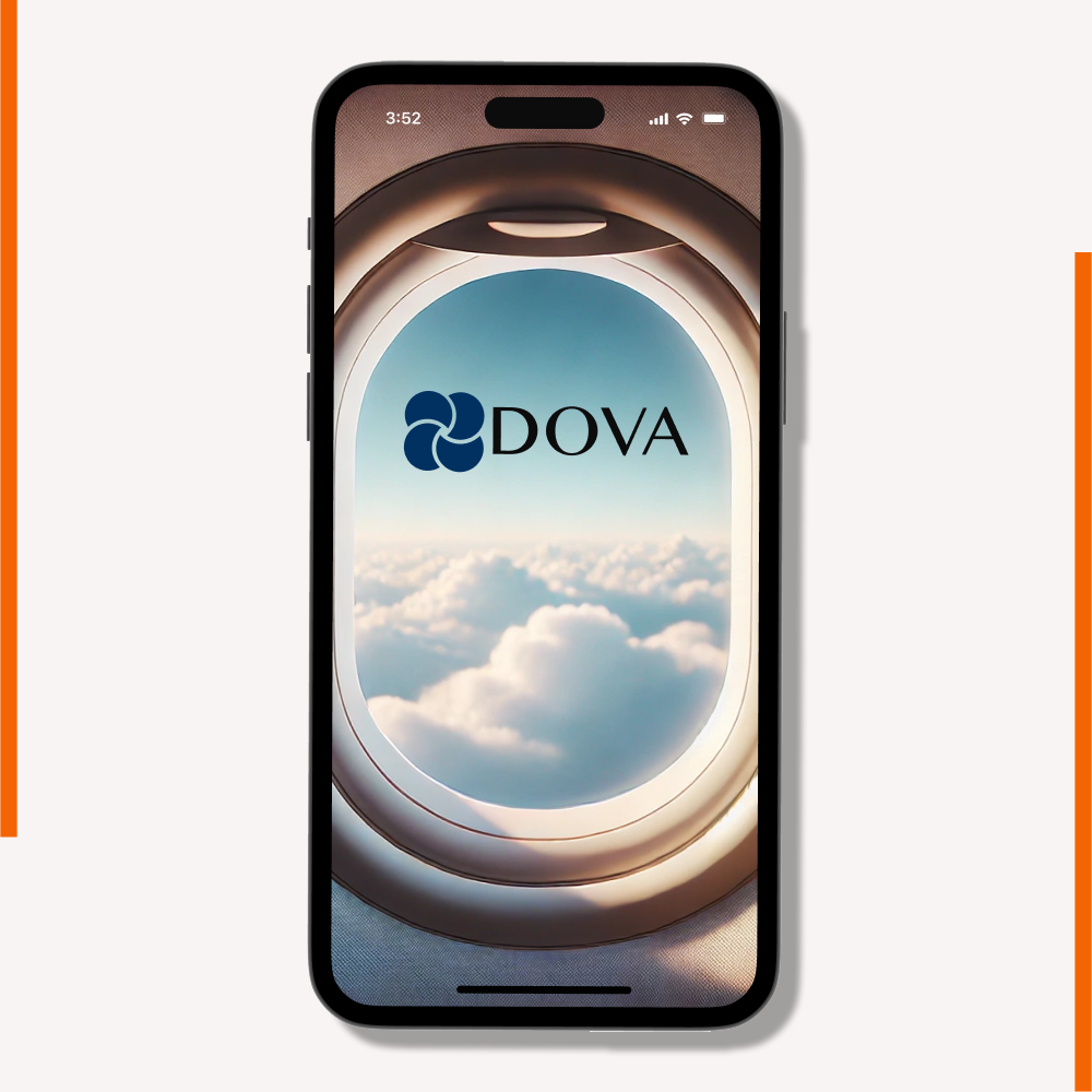
DOVA
Each year, around 7 million children fly without a parent or guardian as unaccompanied minors, according to the U.S. Department of Transportation. Whether it’s visiting distant relatives, traveling between separated parents, or heading to camp, kids often fly solo, while their guardians are left with limited ways to stay connected.
That’s why I designed DOVA, an app that empowers guardians to follow and support a minor’s journey, from planning the trip to safe arrival at their destination.
Project Details
Location: Atlanta / Remote
Timeline: 2024 to 2025 / 3 months
Role: UI/UX Designer, UX Researcher
Project Type: Travel App
Industry: B2C
Prototype: Dova App Prototype



Creative Process
Every successful design begins with understanding the problem. Let’s start at the beginning.
Defining the Problem
Adults often worry about risks such as strangers, traffic, weather disruptions, and being unable to reach a child by phone while they travel alone. Although airlines have established systems to support unaccompanied minors, parents and guardians still lack a reliable way to follow the entire journey. Some airlines offer tracking bracelets, but these provide limited updates rather than a complete view of the child’s travel experience.
Understanding the Users
The app is designed for a diverse audience, including parents, grandparents, relatives, family friends, and camp representatives. Users range from approximately 28 to 80 years old and come from a variety of professional backgrounds, making accessibility and ease of use key design priorities.
How Might We Questions
- How might we reduce the stress and anxiety of parents and guardians when their children travel alone?
- How might we improve the organization and accessibility of information shared throughout a child’s journey?
- How might we provide parents and guardians with complete, accessible information throughout their child’s journey?
Research
I began the project by conducting two research methods to gain initial insights and establish a clear direction for the design process.
Methods Used
Secondary Research: I analyzed articles, industry resources, and airline websites to better understand the current unaccompanied minor travel experience, existing services, and industry standards.
User Interviews: I conducted five 30-minute interviews with individuals who had either used the unaccompanied minor service or were considering it. These conversations provided valuable insights into users’ concerns, expectations, and pain points.
As the project progressed, I adopted a human-centered design approach, ensuring that every design decision was grounded in user research rather than assumptions. By focusing on users’ behaviors, motivations, and challenges throughout the design process, I was able to create a solution that is meaningful, intuitive, and addresses real user needs while minimizing potential risks.
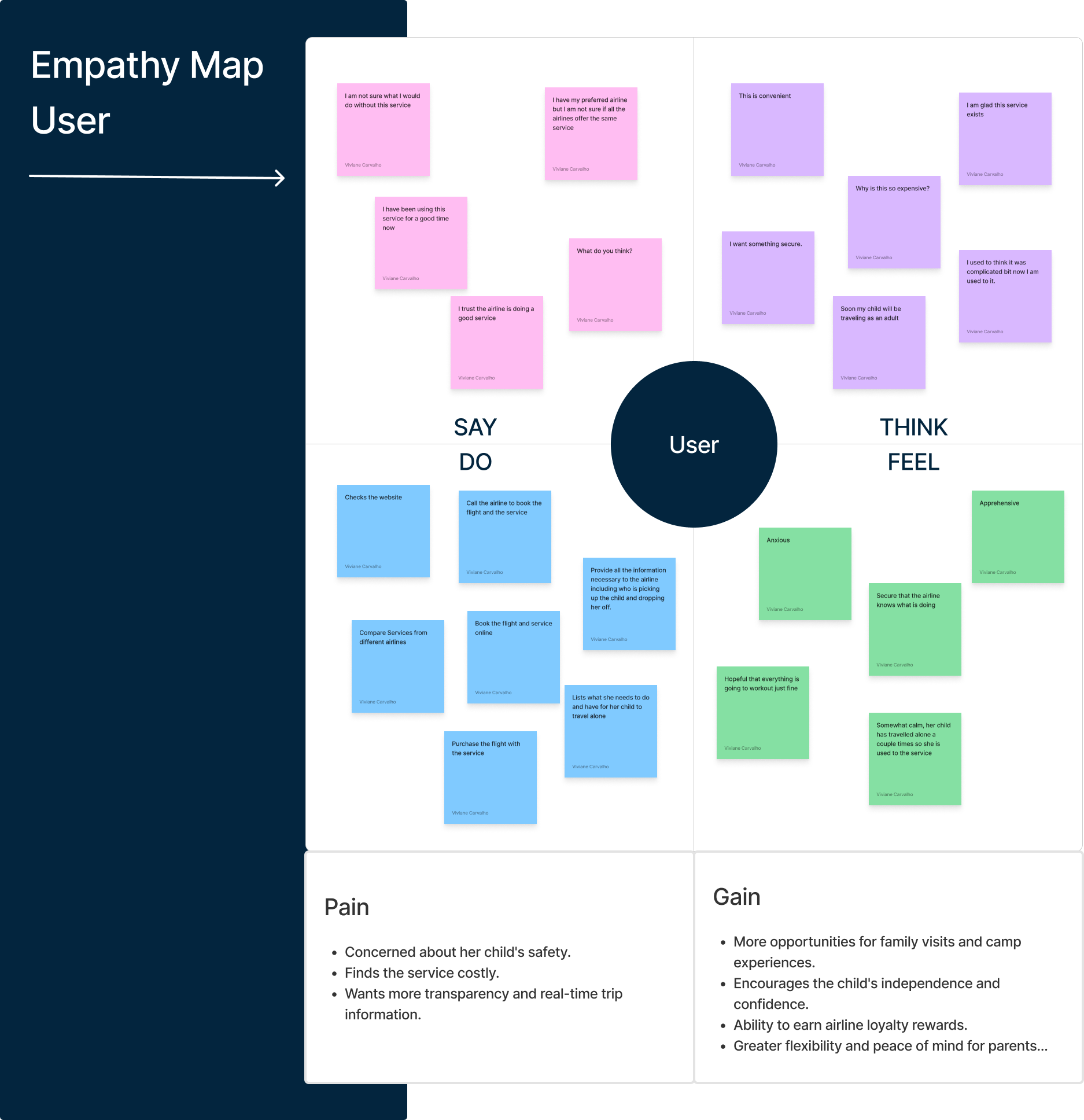
Empathy Map
Using the research findings, I created an empathy map to synthesize our primary users’ thoughts, feelings, needs, and motivations into a clear, user-centered perspective.
USER JOURNEY
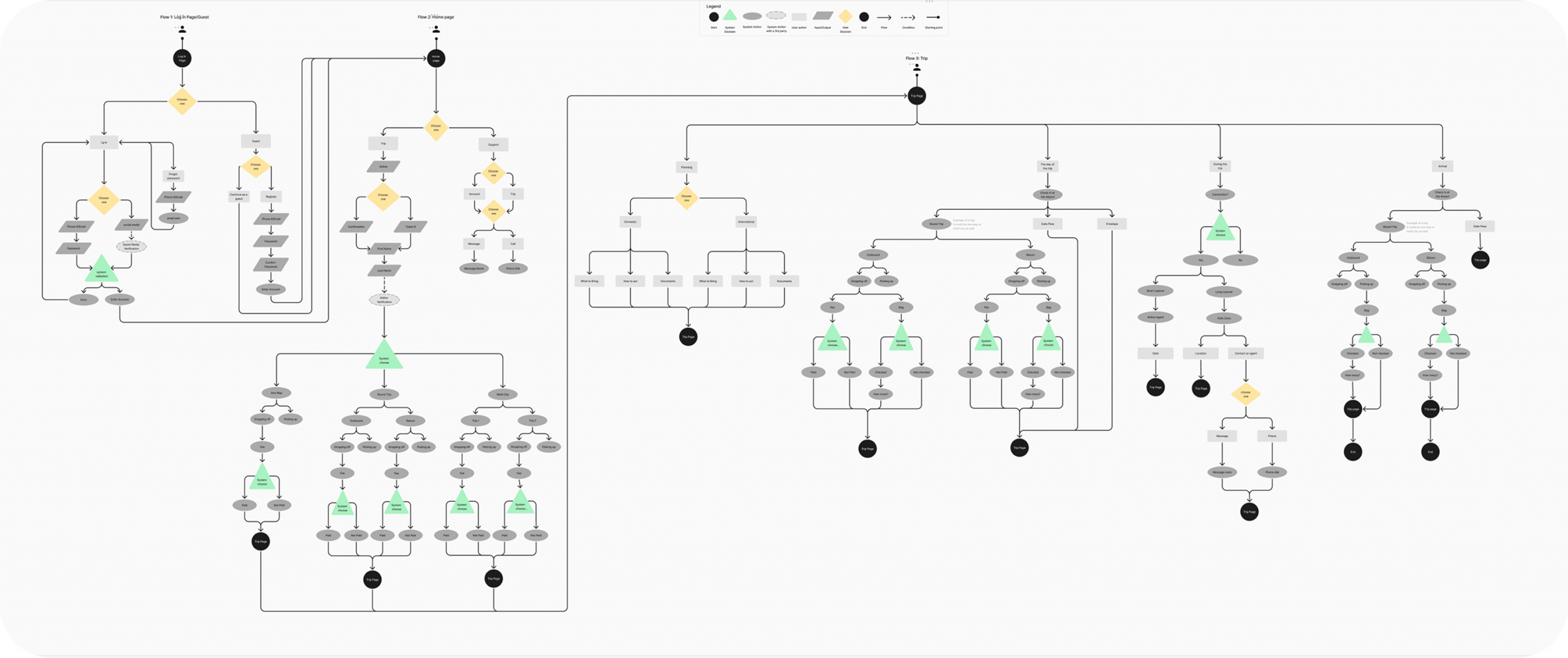
I conducted interviews with five frequent app users from diverse backgrounds to uncover key pain points and understand their goals. Using these insights, I brainstormed potential solutions and developed detailed process flows to map the user journey, ensuring an intuitive and user-centered experience.
Bringing the Concept to Life
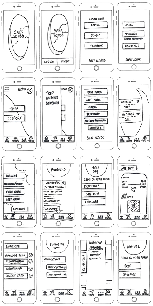
I began by sketching concepts for an accessible, user-friendly app designed to support parents and guardians throughout a minor’s entire travel journey. The experience was thoughtfully mapped from trip planning and check-in to drop-off, real-time flight tracking, layover updates, and airport pickup. Throughout every stage, I prioritized clear navigation, timely information, and easy access to customer support, ensuring users felt informed, connected, and confident from departure to arrival.
Sketches
Starting with sketches allowed me to quickly visualize ideas, explore different concepts, and establish the foundation for the design.
Wireframes
Using wireframes, I established the app’s structure and organized its content into a clear, intuitive layout. This stage allowed me to define the information architecture, prioritize key features, and refine the user flow before moving into high-fidelity designs. By focusing on functionality and navigation first, I was able to identify opportunities for improvement early in the design process, ensuring each screen supported the user’s goals and created a seamless experience throughout the minor’s travel journey.
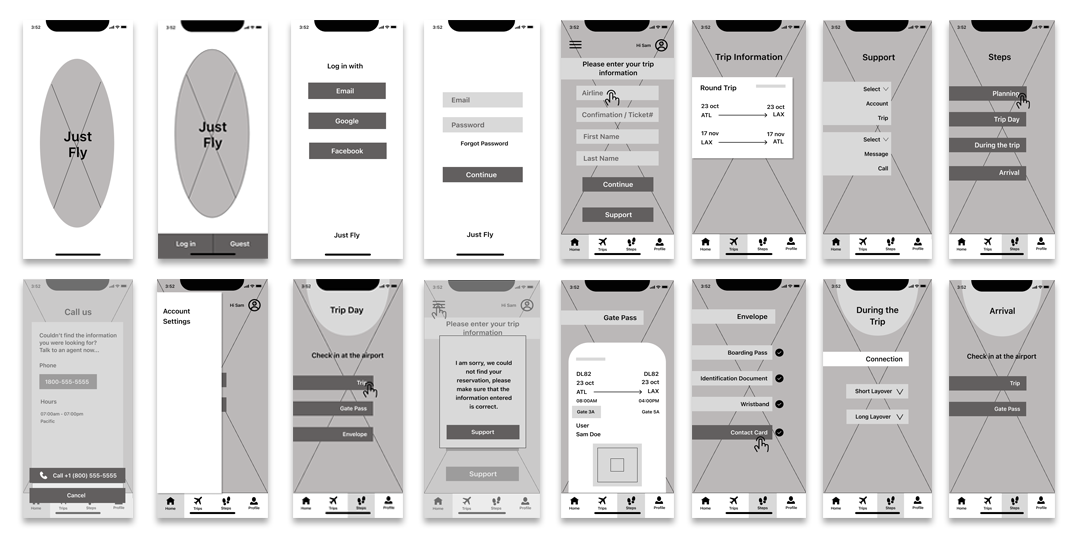
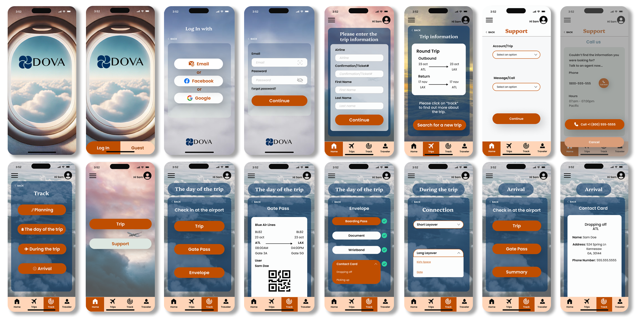
Once the wireframes were finalized, I developed the app’s visual identity by applying branding, typography, color, and interactive elements to create a cohesive and engaging user experience.
Building the brand identity

Style Guide
This is a preview of DOVA’s Style Guide, which defines the visual foundation of the brand. One of the inspirations behind the name DOVA is the Latin word for dove, symbolizing peace, purity, and trust, qualities that helped shape the brand’s identity and overall design direction.

Prototype
With the style guide and wireframes in place, I developed a high-fidelity interactive prototype that brought the user experience to life and demonstrated the app’s functionality and navigation.
USABILITY TESTING
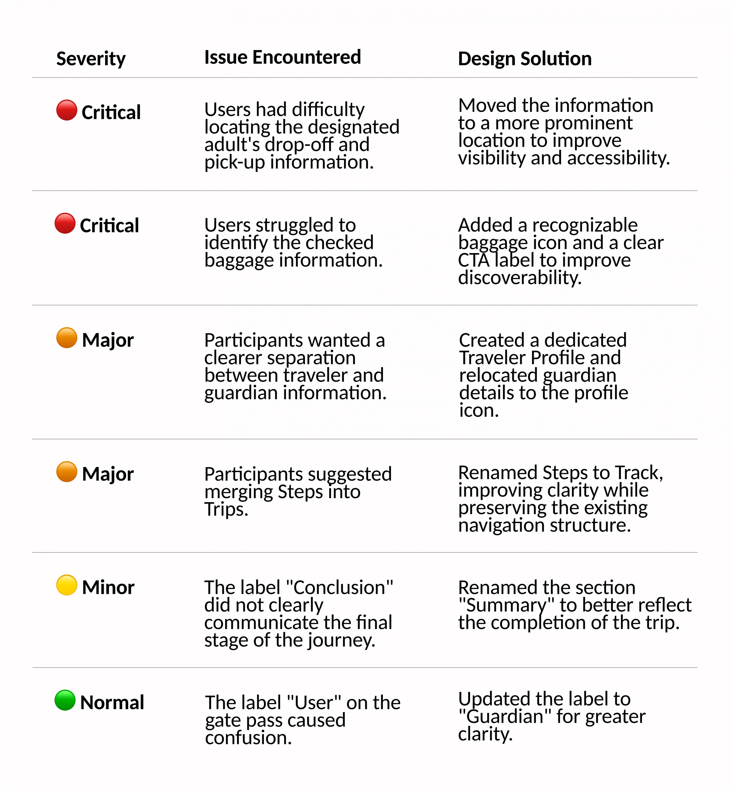
Once the user flows and prototype were refined, I conducted moderated usability testing to evaluate the overall user experience. The goal was to assess how easily participants could log in, navigate the app, and understand the minor’s travel journey and its key features.
I facilitated two rounds of moderated usability testing, with five participants in each session. During each session, participants were asked to complete five realistic tasks while navigating the app independently. Their interactions, feedback, and challenges helped identify usability issues, validate design decisions, and uncover opportunities to further improve the user experience before moving forward with the final design.
Design Revision
After the first round of usability testing, I refined the prototype based on participant feedback and conducted a second round of testing. The updated design was well received, with participants navigating the app easily and successfully completing all assigned tasks.
FINAL SCREENS
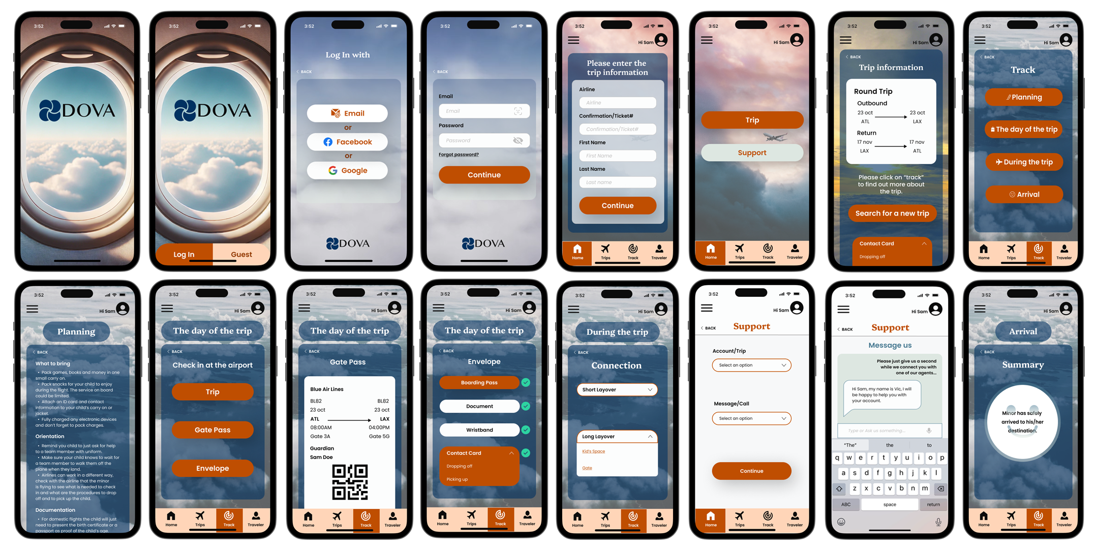
After completing the second round of usability testing and refining the design based on participant feedback, it was time to finalize the interface. These are just a few of the final screens that make up the DOVA app.
REFLECTION
Working on DOVA was a valuable learning experience that strengthened both my design skills and my understanding of the UX process. One of my biggest takeaways was learning to trust an iterative approach, testing ideas, gathering feedback, refining the design, and knowing when it was ready.
While there are a few things I would approach differently today, they reflect my growth as a designer. The most rewarding part of this project was creating an app that helps adults stay informed and involved throughout a minor’s travel journey.
Interested in seeing more? Here are a few additional projects that showcase my design process, problem-solving approach, and experience creating user-centered digital products across different industries.